TL;DR – Just want to see the final design? Jump down to the “Prototyping” section below!
Over the past couple of years, I was considering what particular contributor role I would best enjoy in game development. I had been a programmer for most of my software career, and while I still enjoy implementation tasks I am completely fine letting someone else deal with the code-level details (especially the debugging). I do have a background in art and music, but it would be better to leave these to those who have invested in it much more fully than I have. Narrative design would be fun to do as well, but I have no previous experience in narrative writing so I’d be starting from scratch on that.
Throughout my software career, whether I was a programmer or a manager, the one area I loved working in was user interface and user experience (UI/Ux) design. It was extremely fulfilling to build UI components that implemented the designer’s vision down to pixel perfection, and I looked forward to every whiteboarding meeting I had with product managers and designers to figure out how to best build out new experiences. I had a chance to talk virtually with Greg Foertsch at GDC 2021 about what role I could play in game development that matches my strengths, and after discussing my career he pointed out that Ux design was not only something I was passionate about and experienced in but it’s also a role that’s harder to find in the games industry. It was the perfect niche for me to explore more deeply.
With that in mind, I’ve recently been taking training more formally starting with the courses recently offered on Humble Bundle for Ux design. In particular, the User Experience: The Big Picture course gave me a nice framework for the Ux design process, where designers:
- Perform industry and user research to better understand the problem and how others are solving similar problems
- Put together an information architecture that better organizes what users need to know, find, or do
- Wireframe and visually design the solution to make a straightforward and enjoyable experience for users
- Perform usability testing to validate the effectiveness of the solution
All of this has led me to begin building a portfolio of Ux design explorations using this process. Since my long-term interest is in developing games, I will be putting together a series of blog posts for these explorations as part of my portfolio in which I take an older game with a poor or awkward user experience and apply modern design insights to it while adhering to the visual and input limitations of its original system; for example, I will ensure the solution works with the system’s resolution and color palettes and will not rely on additional buttons to improve the experience. That said, these explorations may propose solutions that might not work with the computational power of the system, such as a restriction on or performance issues with the number of sprites on the screen at once, but I wouldn’t be able to validate those easily for these older systems and they could be optimized during implementation, so I won’t be letting those influence the designs.
To kick things off, I took on the challenge of improving the Mega Man 2 sub-screen.
Original Design
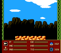
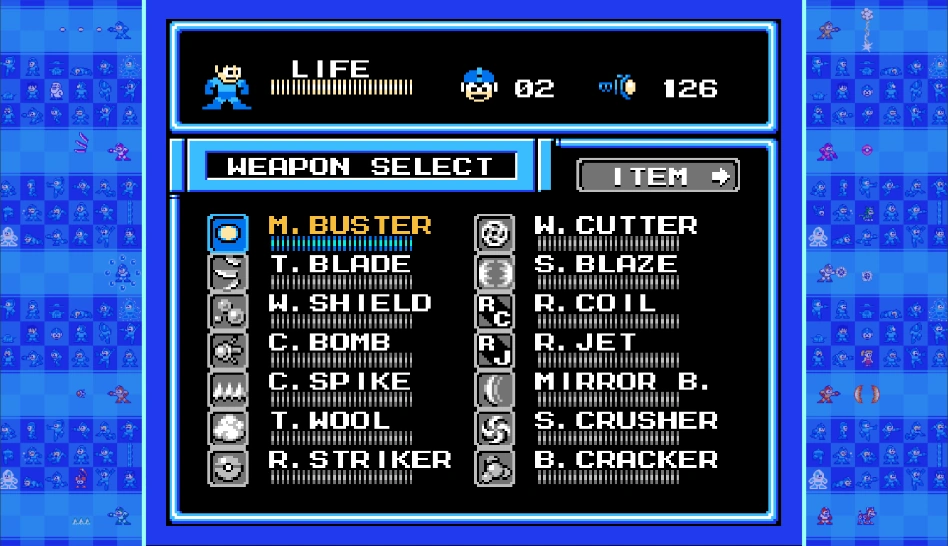
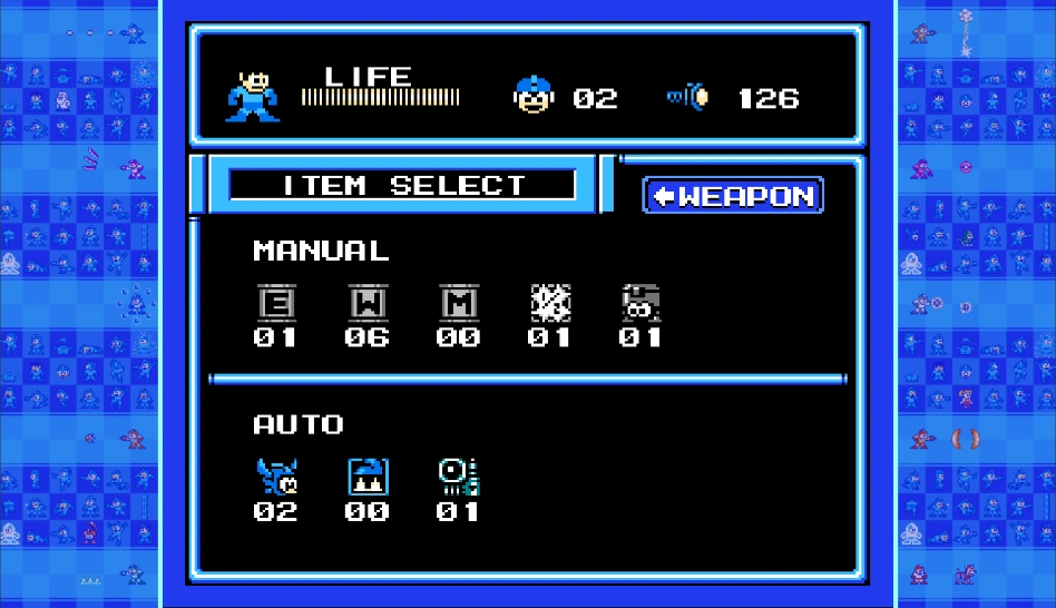
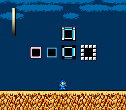
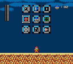
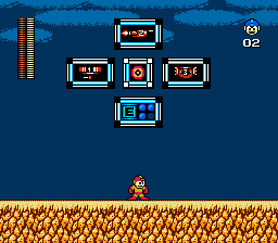
Mega Man 2 was released in 1988 on the Nintendo Entertainment System. I chose the Mega Man 2 sub-screen for my first Ux design exploration because I remember playing the game as a kid and having trouble discerning what I was selecting. Here’s the original two-page sub-screen, shown when the player presses the Start button during gameplay to pause the game:
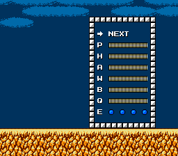
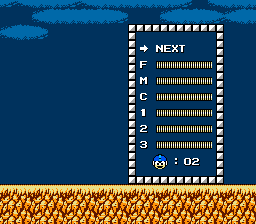
At a glance, there is little here to differentiate what the player is shown, as each selectable option is represented by a single letter or number, and all but “E” are horizontal bars with no visual distinction from each other. To clarify what is being displayed in this sub-screen, here’s an explanation of each option:
- P – Mega Buster (player’s default weapon)
- H – Atomic Fire (Heat Man’s weapon)
- A – Air Shooter (Air Man’s weapon)
- W – Leaf Shield (Wood Man’s weapon)
- B – Bubble Lead (Bubble Man’s weapon)
- Q – Quick Boomerang (Quick Man’s weapon)
- E – Energy Tanks (refills the player’s health)
- F – Time Stopper (Flash Man’s weapon)
- M – Metal Blade (Metal Man’s weapon)
- C – Crash Bomber (Crash Man’s weapon)
- 1 – Item 1 (a platform that slowly ascends)
- 2 – Item 2 (a jet that moves horizontally)
- 3 – Item 3 (a platform that bounces until it hits a wall, and then slowly ascends)
- Player’s Lives
Each bar represents the amount of power remaining for the weapon or utility, but an exception is that the P bar represents the player’s current health since the Mega Buster does not have depletable weapon power.
When the sub-screen is open, the player can use the controller’s directional pad to move the “cursor” (the current selection blinks the letter, number, or right arrow in the case of NEXT) and press the Start button to confirm the selection and return to the game. E is a special case, though, which will refill the player’s health to full when the player presses Start with it selected.
After studying the contents of the sub-screen, I analyzed what information is being conveyed to the player. Ultimately, it came down to five things:
- The total remaining lives (zero inclusive)
- The total remaining energy tanks (maximum of four)
- The player’s current health
- Which weapons and utilities the player has unlocked
- How much power remains for each unlocked weapon and utility
User Research
I, of course, was a user whose experience I could tap to determine how this experience was received, but to get some more user feedback I created several posts on Reddit’s /r/gaming and /r/megaman subreddits, Imgur, Steam’s Mega Man Legacy Collection discussion forum, and the Rockman EXE Zone forum looking for other players who could answer these two questions:
- What are your biggest pain points in regards to using the Mega Man 2 sub-screen to view/select weapons and utilities and use Energy Tanks?
- If you could improve it in one way, what would you do?
Pain Points
By the time of this post, I had not received any responses from the Steam or Rockman EXE Zone forums, but I did get some great feedback from Reddit and Imgur. In particular, the primary pain points they identified were:
- The one-dimensional navigation up and down, which was exacerbated by…
- The NEXT option being the only means of switching pages
- No discernable order to the options
- A lack of clarity around what the options represent
- The ease of accidentally using an Energy Tank even when at full health
As a player myself, I also encountered the following pain points:
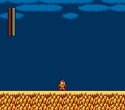
- The player character disappears while the sub-screen is open, so the player loses some context into what he was last doing (e.g. running, jumping over a pit, being hit by an attack, etc.)
- The number of actions required to change a selection in the sub-screen range from two in the best case (move up or down, press Start) to thirty when activating an energy tank while using the 3 utility and returning to that utility (navigate from 3 to NEXT, press Start, navigate to E, press Start to use the energy tank, navigate to NEXT, press Start, navigate to 3, press Start)
- The player’s health is represented by P, but all others represent the remaining weapon or utility power, which presents an inconsistent context
- The player must go to the second page to see her remaining lives
- The E option is unclear about its purpose when empty, as it is blank without a bar like other options
- Because weapons must be unlocked before they appear in the sub-screen, it is mostly white space in the early game
- It is unclear how many pages exist until the player tries paginating between them
Suggested Improvements
There were several improvements that the Reddit and Imgur commenters suggested, which provided some interesting insight into what they felt would improve their experience as well as make their pain points even clearer. For example:
- Being able to press left and right to paginate rather than exclusively using NEXT (pain point: one-dimensional navigation)
- Halve the length of each bar to try putting both pages on screen at once (pain point: pagination and visibility of options)
- Replacing the letters with weapon icons (pain point: lack of clarity)
- Replace the power bars with a longer name and use a percentage for remaining power rather than a bar (pain point: lack of clarity)
- Color-code the bars based on the bar shown when the weapon is selected (pain point: lack of clarity)
- For example, the Atomic Fire bar in the sub-screen could match the color shown next to the player’s health during gameplay when it has been selected:
Industry Research
Now that I had identified several pain points around the Mega Man 2 sub-screen experience, I wanted to see how other games had handled an ability selection menu to see if there were insights and improvements to glean. What is great is that with an iconic series like Mega Man there are a plethora of other games to explore, including later in the series, parallel series such as the Mega Man X series, and other Mega Man-like games. In particular, I took a look at the following games that I felt could provide significant insights due to their relationship with Mega Man 2.
Mega Man 3
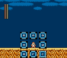
Let’s start with the obvious choice. Mega Man 3 was released two years later in 1990, and being the next entry in the series it shows what immediate changes they made to the sub-screen, especially since Mega Man 2 gave players their first pagination experience due to the increased number of weapons and utilities over the original Mega Man. Here’s what we got in the next game in the series:
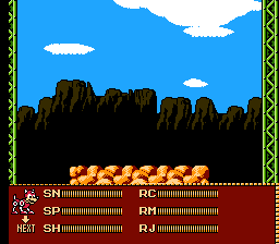
Some elements of the Mega Man 2 sub-screen made their way into this iteration, including P still representing the Mega Buster and the player’s health and the two-page layout. However, there are a few new additions that help improve the experience, such as:
- The Next button is back, but the player can also use the B button to change pages quickly despite the current selection
- Weapons and utilities are now represented by two characters rather than just one, though part of this is out of necessity with the robot master names (Snake Man, Spark Man, and Shadow Man all start with “S” so they need something else to distinguish them) and the different Rush utilities (Mega Man’s helpful robot dog). Additionally, selected weapons and utilities other than P visually show what they represent with colored icons or Rush’s sprite.
- Lives are now shown on the first page for quick reference
- Energy Tanks now are represented with their in-game icon and include a numeric counter, which more clearly communicates the empty state when no Energy Tanks have been collected. Also, the player is prevented from using an Energy Tank when at full health.
Mega Man 4
Coming out in 1991, a little over a year after Mega Man 3, the fourth iteration brought an end to a paginated sub-screen, combining everything the player needs to see and do into one full-screen experience.
Mega Man 4 keeps some of the things from the previous game’s sub-screen like the Energy Tank icon with a numeric counter and showing the lives counter right away, but also brings some new patterns, such as:
- Pagination is gone, and the player can change their selection by pressing up, down, left, or right
- Weapons and utilities are now represented with full names in addition to colored icons, with the names of the robot masters whose weapons were obtained, the Rush utilities, and the Wire and Balloon utilities
- Selected weapons and utilities are visually highlighted (though not color-coded to their bars when shown in-game)
- The player’s health bar is now decoupled from the Mega Buster’s power bar (the Mega Buster’s bar never runs out)
We do lose some context by going full-screen with this sub-screen, but the new improvements make it palatable.
Side note: the choice to include a sprite of Mega Man in the menu seems odd because it does not change accordingly when the selection changes, other than changing to show Rush when the Rush utilities are chosen. I wanted to call this out since it makes an improved appearance in the next entry in the series.
Mega Man X
Two years later in 1993, Mega Man took a different direction and confused everybody at the time about its place in the series (What does the “X” mean? 10?). Released on the Super Nintendo, it had the benefit of the newer system’s more numerous colors and faster processing, but despite this, I felt it would be a good entry to explore to see how they iterated on the series’ sub-screen with more options available.
Immediately we can see increased visual detail with the background, borders, player sprite, and other UI elements. However, at its core, it’s fairly close to Mega Man 4’s design in how they organized the information architecture. Some iterative improvements they’ve made, though, are:
- Weapon names are now the abbreviated name of the weapons (e.g. B.Cutter is the Boomerang Cutter), rather than the robot masters from whom the player gets the weapons
- The player sprite now updates its colors based on the current selection, giving an additional visual reminder of the selection
Another interesting addition to Mega Man X that is peripheral to the sub-screen is that for the first time, making use of the increased number of buttons available on the Super Nintendo controller, the player can now cycle through their obtained weapons by pressing the L and R buttons. This allows them to bypass the sub-screen altogether and stay in the action.
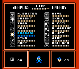
Mega Man 10
After Mega Man 4, the fifth and sixth entries in the series followed closely with the same sub-screen design. Later, Mega Man 7 and 8 mostly kept the bar-based sub-screen, though introducing pagination again to handle the increased number of game-specific items that needed to be tracked. The NES-styled Mega Man series ended with Mega Man 8 in 1996… until it unexpectedly came back with Mega Man 9 over a decade later, followed by Mega Man 10 in 2010. I was interested in exploring this particular iteration because it was the last one to be styled like an original Nintendo game. While not being released on the then-obsolete original Nintendo system, it maintained the system’s limitations when designing its visuals and experience, though with the caveat of allowing the L and R buttons to be used for cycling through weapons like in Mega Man X.
Despite being many generations past Mega Man 4 and Mega Man X… there weren’t any new non-game-specific patterns added. As you can see below, it is mostly a combination of Mega Man 4’s design with Mega Man X’s weapon and utility naming convention, with a second page for the Energy Tanks and other game-specific items.
One nice touch, though, is that the pagination only affects the weapons, utilities, and items; the player’s health bar, remaining lives, and (for this game) currency remain at the top while the sub-screen is open regardless of what page the player is on.
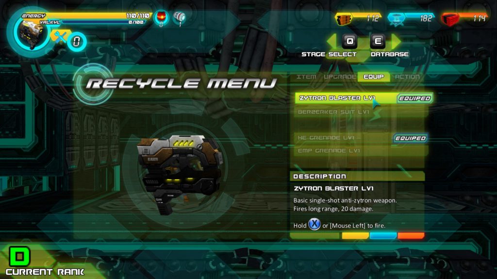
A.R.E.S.: Extinction Agenda
A.R.E.S.: Extinction Agenda was a game I picked up about a decade ago after it was released in 2010, and it had a strong Mega Man feel to it, with its robot protagonist, side-scrolling gameplay with bosses at the end of each level, and being able to swap between suits to change attack options. When I started on this design exploration, I loaded it back up to see how it handled the weapon selection and if anything could be gleaned from it.
This game uses a menu system where suits can be changed by navigating a list in the Recycle Menu, moving up and down, and pressing a button to select the suit. There wasn’t much that was novel here in its design, but it did also support changing suits in a linear order by pressing Ctrl+T, though not as helpful as Mega Man X’s and 10’s ability to go back and forth linearly using L and R.
Mighty No. 9
In 2013, Mega Man fans were excited to discover a Kickstarter campaign for Mighty No. 9, with “classic Japanese side-scrolling action, evolved and transformed by Keiji Inafune [the co-creator of the original Mega Man game], an all-star team of veteran Mega Man devs… and YOU!” It was a chance for the spirit of the original series to get a fresh start in the modern game industry. Unfortunately, due to poor execution, technical issues stemming from a simultaneous release on several systems, and a general lack of character and fun, Mighty No. 9’s 2016 release did not live up to the hopes of fans of the original series.
Despite this, it’s worth taking a look at how Mighty No. 9 handled its sub-screen and “form” (i.e. weapon) selection. It does technically have a sub-screen, but it is simply paired with the pause menu. Unfortunately, it is very light on information, primarily relying on just a colored icon and bar with no form name and a percentage remaining, which is a bit redundant given the bar shown.
There are some real-time form-changing options, though. In particular, forms can be selected via a vertical menu, though this does require time navigating the linear list and a final button press to make a selection.
Finally, it also gives the option to pre-select up to three forms for quick access, allowing these forms to be selected immediately when needed.
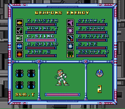
Mega Man 11
After an eight-year hiatus, and possibly from the interest generated by Mighty No. 9, the core Mega Man series rose again with the launch of Mega Man 11 in 2018. This time, though, no pretense of maintaining the NES limitations remained; the eleventh entry jumped to 3D and made use of all of the input buttons available to it. Being the last entry in the core series at the time of publication, I wanted to see what new improvements it introduced, especially now that it wasn’t shackled to its NES origins.
What’s interesting is despite the jump to 3D and higher resolutions, much of the sub-screen design remains the same: we have weapon power bars, the player character changes colors based on the selection, the player’s health and Mega Buster (M. Buster) are decoupled, and the lives and energy tanks are shows with icons and numeric counters. Even the ability to cycle through weapons is retained, though now with the option to hold both the L and R buttons and reset to the Mega Buster. However, there are some interesting things to glean from this game’s sub-screen:
- The weapon power bars are now color-coded for visual distinction and identification
- The lives and items not only use a numeric counter but also show the maximum possible to hold
- The selected item now has a description to provide instructions and add detail to the game universe
Just as the ability to cycle available weapons allows players to bypass using the sub-screen altogether, Mega Man 11 introduced a new interaction only possible due to the analog sticks on modern controllers that facilitates quickly jumping straight to the weapon the player needs. By using the right analog stick during gameplay, a radial menu appears showing the weapons around the player in the same order as their robot masters appear on the level select screen. The player simply moves the analog stick in the direction of the weapon they need, or presses the right analog stick in to reset to the Mega Buster.
All in all, this provides the fastest way in a Mega Man game to switch weapons, making the most of the inputs now available to players.
Improving the Mega Man 2 Sub-Screen Design
Going through the experience of user and industry research, I was able to get a feel for what I liked and what I didn’t like in how the Mega Man series evolved its sub-screen. In particular, I liked the radial menu introduced in Mega Man 11 that allowed for very quick access to weapons, and wanted to incorporate that in some manner. Also, the icons introduced in Mega Man 3 made it very easy to know what the player is selecting despite the highly shortened name, and the costume color changes introduced in Mega Man X and weapon bar color changes introduced in Mega Man 11 are great for visual association with selections.
Information Architecture and Wireframes
With a lot of great insights to choose from, I set out to see what improvements I could bring back to Mega Man 2’s sub-screen. First off, I focused on the parts of the information architecture that I had to work with, auditing the content of the original sub-screen (i.e. “Original Design” above) and splitting the content into three buckets:
- Weapons: The Mega Buster and the eight other weapons obtained from the robot masters as the player progresses through the game.
- Utilities: The 1, 2, and 3 utilities as well as the Energy Tanks collected.
- Information: Explicit values like lives and health remaining and visual cues like the coloring of the currently selected weapon power bar and player character costume.
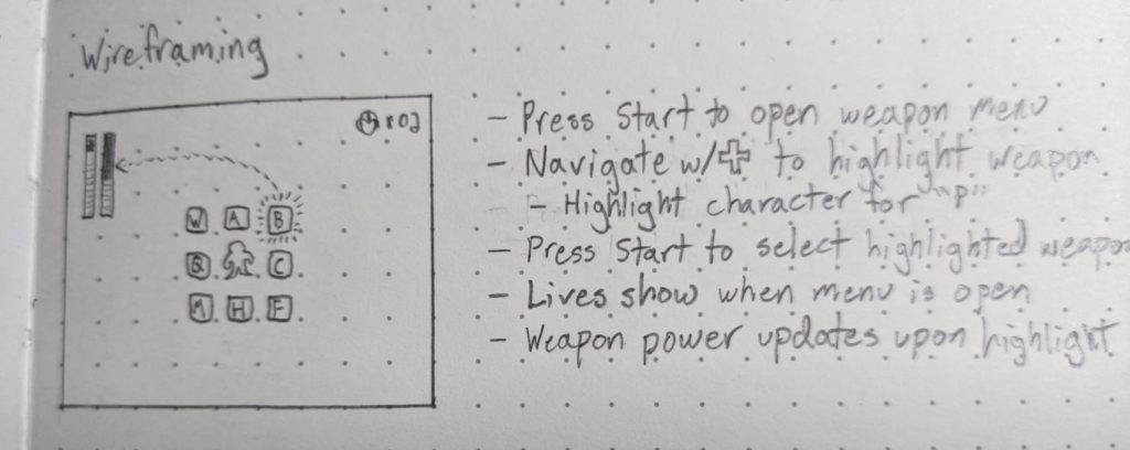
Next, I started drawing some wireframes to mock up ideas based on this information architecture and the insights from my research. What I tried to focus on primarily were the following:
- Quicker access to weapons and utilities
- Visual cues to improve association
- Staying within the restrictions of the system as best I can from a design perspective (as discussed above)
Staying within the restrictions did mean some ideas needed to be discarded, such as navigating through selections without the sub-screen since there are no L and R buttons to use. Interestingly, the Select button had no use in the original game, but it would be a poor experience to unidirectionally navigate through a large list of items by pressing it over and over again.
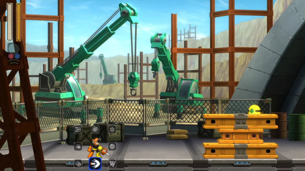
My first pass was to incorporate the radial menu of Mega Man 11:
In this mock-up, when the player presses Start the radial menu would appear around the player with weapons organized in the same placement as on the stage selection screen. The player would navigate using the directional pad to select a weapon or highlight the player to return to using the Mega Buster. As the player moves the selection over weapons, it would show the weapon power bar in its normal placement during gameplay when the weapon is in use, color-coded and in place for familiar context, and the player’s costume colors would change as well. Also, the remaining lives would be always visible in the top-right corner. The idea is that a similar menu would be shown for utilities by pressing Select.
The next wireframe I made was to try making a radial menu that behaved similarly to Mega Man 11’s by holding directions:

Here, the player would hold the directional pad in the direction of the weapon or utility they wanted to use, then press Start or Select to select it and return to gameplay. Additionally, this would use icons of what is selected rather than letters to make it clearer what each selection does at a glance. All of the other visual cues from the previous wireframe would apply here as well.
Also, in the case of the utility sub-screen the player can push in the direction of the Energy Tank icon and push Select to use the Energy tank, though we can put in the validation to prevent using one if the player is at full health. If the player presses Select when not holding a direction, the radial menu would close and the player would be using their last selected weapon that they had equipped when they opened the utility sub-screen.
This design was the first one I had in mind before I started on this project, but as I took a look at the experience I realized this would have been highly inaccessible.
- For the weapon radial menu, it would require extra precision for selecting diagonal weapons since the directional pad would need to be pressed on two sides of the plus shape to perform that diagonal action, and the original Nintendo controller’s directional pad wasn’t as diagonal-friendly as more modern game controllers with analog joysticks.
- For the utility radial menu, holding a direction and pressing the Select button, the left-most button other than the directional pad itself, with the player’s right thumb would mean moving the player’s right hand out of position when they were thrown back into the gameplay, requiring them to quickly move it back to respond to immediate threats.
- Even if I changed this to no longer require the Start or Select buttons to be pushed and instead select whatever weapon or utility was highlighted when the directional pad was no longer pressed, the inaccuracy of the directional pad presses could cause the player’s left thumb to accidentally move slightly as it released and trigger a different selection to be executed.
In the end, I still liked the concept of the radial menu but felt that being able to navigate it with multiple presses was the best combination of quick access and more accessible controls. Additionally, the circular visual of the radial menu was not something seen in Mega Man 2, which had more hard corners and lines, so it might look out of place.
Visual Design
Now it was time to put everything together into a high-fidelity design prototype, for which I used Adobe Photoshop for creating the images. Before I could start on that, though, I had a question to answer about the visual design. I wanted to represent the weapons and utilities in a way that matched the look and feel of the game, so I explored some options for borders to use around the selectable items that corresponded to other borders used in the UI.
From left to right, the borders above came from:
- Around the start/password selection, password entry, and password error screens
- The grid within the password entry screen
- Around each of the robot masters on the stage selection screen (the corners blink)
- Around the original sub-screen
While the password grid border is concise and the sub-screen border is familiar, I went with the stage selection borders in the end. These provide both a familiar context when ordering the weapons in the same order as on the stage selection screen and an already-established pattern for highlighting a selection.
Using these borders, I first designed my first wireframe in which the radial menu appeared around the player:
This also incorporated the color-coded weapon power bar being shown as it is during gameplay and being updated when the player changes their selection so she can quickly see how much power she has for the selected weapon.
By working on this high-fidelity mock-up, I began to realize some flaws with the design:
- While I liked the use of the radial menu for selection, I wasn’t sure about having the player be selected in the center for reverting to the Mega Buster.
- The border dimensions used for the other weapons would not fit around the player and having a bigger border for the player felt like I would be trying to force the pattern to work.
- It made it harder to understand that the player represented the Mega Buster since the player’s costume is changing when weapons and utilities are selected, so it sends an unclear message that to select the costume-colored player is to remove that costume and revert to the default weapon.
- I realized that the radial menu takes up a fair amount of space, so if the player is below the starting height on the screen as seen above, the bottom items will be off the screen or would no longer have the player in the center if they were forced up to be visible.
- By using the letters like in the original sub-screen, the radial menu just felt noisy and still unclear of what is selected.
With my next attempt, I moved the radial menu up higher to a fixed position and replaced the letters with icons from the actual attacks:
This ended up much nicer, and the icons provided much better context and made the radial menu colorful. Now it would be easy to correlate the player’s selection with the attack it produces.
For the remaining lives counter, I added it to the top right using the same layout as in the original sub-screen:
I felt there was something a little off with this, so I explored some other options for how to display the lives:
With this, I realized what it was: the dissymmetry that was brought by the horizontal display of the lives icon and counter conflicted with the vertical nature of the health and weapon power bars on the left. Once I tried stacking the lives icon and counter, it made it feel much more visually symmetric.
One issue I found, though, was that the same icon was representing both lives and the Mega Buster. I tried quickly replacing the Mega Buster icon with Mega Man’s face sprite so they were at least different:
Despite this, we were still dealing with a similar issue in the original design: the Mega Buster was represented by Mega Man himself. To fix this, I followed the pattern with the other selectable weapons and added the Mega Buster pellet to the center:
![]()
The weapon sub-screen was in a really good state by this point, so I shifted my focus over to the utility sub-screen. Something that immediately became apparent when applying this same selection pattern to the utilities was that their icons are twice as large as the weapons’, so I had to expand their boxes to fit them appropriately:

This worked out well like with using icons for the weapons; the utilities were immediately clear about what they are, so much more than the original “1,” “2,” and “3” single-character options. It also maintains the selected weapon if the player closes the sub-screen.
As for the Energy Tank, I used the icon as per my sub-screen pattern but I also used the counters that the original sub-screen used for consistency, especially since the count cannot exceed four like it can in later games. However, something else I incorporated was empty states for the counters when the player does not have the maximum number of Energy Tanks, which was an issue in the original design because the space was left entirely blank if the player did not have any Energy Tanks, making it unclear what “E” was meant to represent. Now, when the player is not full of Energy Tanks, empty states are shown instead:
Prototyping
TL;DR readers, welcome!
From my design work at Adobe I have experience using Adobe XD for creating design mocks for discussion and implementation, so that was my go-to when starting this prototyping phase. However, I was surprised to find that XD did not support animated GIF files, which meant I couldn’t make a quick animated image of the selection blinking and include it in my XD prototype. That’s unfortunate. Well, right before I started this step, Adobe announced its intentions of acquiring another design application company called Figma, and Figma does support animated GIFs. So…
One crash course later, I created animated GIFs for all of the selection states in Photoshop and wired them up in Figma to create a high-fidelity prototype that felt like the original game. You can try out the prototype below, minus using Energy Tanks (if you see a white screen temporarily while navigating the sub-screens, that’s Figma’s way of letting you know it’s loading an image):
As a note, while this prototype restricts jumping directly from the weapon sub-screen to the utility sub-screen and vice versa except when the Mega Buster is selected, when implemented the player would be able to jump between them despite what is currently selected; it would have just been a lot of extra cross-wiring to be done in the Figma prototype to convey the same idea.
Usability Testing
With the prototype done, I shared it with those who had responded to my user research questions. Only one person responded, but Gamer_Dude_7 from my /r/Megaman post gave some good feedback:
I like it! It’s nice attention to detail how you had the 3 x 3 weapons grid match the stage select positions of the robot masters. The icons make it easier to know what weapon you’re selecting, and I think it’s convenient to have the weapons and utility on separate pages. The only potential downside to your menu design is that it makes it a bit harder to compare how much weapon energy each weapon has since it only displays the energy of the highlighted weapon. But the pros of the menu really outweigh the cons and I like it a lot more than the original menu!
Going back to the original pain points, we can see that they are addressed:
- The one-dimensional navigation up and down, which was exacerbated by…
- Navigating is now three-dimensional: two dimensions on one sub-screen but the player can switch sub-screens at any time
- Navigating is now three-dimensional: two dimensions on one sub-screen but the player can switch sub-screens at any time
- The NEXT option being the only means of switching pages
- We still have pagination represented as sub-screens, but the player can change sub-screens at any time
- We still have pagination represented as sub-screens, but the player can change sub-screens at any time
- No discernable order to the options
- Weapons are now ordered according to the positions of the robot masters on the stage select screen
- Weapons are now ordered according to the positions of the robot masters on the stage select screen
- A lack of clarity around what the options represent
- Icons of the weapons and utilities make it clear what’s being selected
- Icons of the weapons and utilities make it clear what’s being selected
- The ease of accidentally using an Energy Tank even when at full health
- This can be disabled during implementation and a visual or audible response can be given to indicate this action is not possible when attempted
- This can be disabled during implementation and a visual or audible response can be given to indicate this action is not possible when attempted
- The player character disappears while the sub-screen is open, so the player loses some context into what he was last doing (e.g. running, jumping over a pit, being hit by an attack, etc.)
- The player remains shown and visually changes as the weapon and utility selection changes
- The player remains shown and visually changes as the weapon and utility selection changes
- The number of actions required to change a selection in the sub-screen range from two in the best case (move up or down, press Start) to thirty when activating an energy tank while using the 3 utility and returning to that utility (navigate from 3 to NEXT, press Start, navigate to E, press Start to use the energy tank, navigate to NEXT, press Start, navigate to 3, press Start)
- The number of actions required now ranges from two in the best case to four in the worst case (move from one corner of the weapon sub-screen to the opposite corner)
- The number of actions required now ranges from two in the best case to four in the worst case (move from one corner of the weapon sub-screen to the opposite corner)
- The player’s health is represented by P, but all others represent the remaining weapon or utility power, which presents an inconsistent context
- The player’s health is now decoupled from the Mega Buster
- The player’s health is now decoupled from the Mega Buster
- The player must go to the second page to see her remaining lives
- Remaining lives are always visible in the sub-screens
- Remaining lives are always visible in the sub-screens
- The E option is unclear about its purpose when empty, as it is blank without a bar like other options
- The empty states for the Energy Tanks and their icons show that it’s an item that has a maximum number that can be obtained at once
- The empty states for the Energy Tanks and their icons show that it’s an item that has a maximum number that can be obtained at once
- Because weapons must be unlocked before they appear in the sub-screen, it is mostly white space in the early game
- There will still be white space in the early game, but it will quickly become clear that the white space represents obtainable weapons and utilities because of the visual organization of the sub-screen
- There will still be white space in the early game, but it will quickly become clear that the white space represents obtainable weapons and utilities because of the visual organization of the sub-screen
- It is unclear how many pages exist until the player tries paginating between them
- There are more clearly only two “pages” represented as sub-screens, accessible by pressing either Start or Select
Conclusion
I enjoyed going through this Ux design exploration as an exercise to better understand the end-to-end process. It was good to experience each step, from user and industry research, to wireframing, to visual design, to usability testing, so I could get a taste of what each entailed. The insights from other Ux design courses I am going through and my past experiences at work helped show me that my passion and skillset seem to align best with interaction design, which the Interaction Design Foundation says “is the design of the interaction between users and products.” For example, user and industry research were necessary for this exercise, but what got me excited was getting to the point of wireframing and visually designing the new sub-screen, iterating until I felt it met the player’s needs and goals, and then sharing it with others.
I also learned in parallel during this exercise how deep interaction design can be. I’m currently going through the Become a User Experience Designer LinkedIn Learning course, and it gave me a lot more exposure to the user-centered design workflow, including gathering and analyzing user data, creating personas, ideation, creating scenarios and storyboards, and paper prototyping. In the Mega Man 2 sub-screen exercise, I jumped pretty quickly from user and industry research to ideation (really what I’ve called wireframing above), then jumped straight to visual design. In my next exercise, I will most likely try the user-centered design approach to take that portion of the process a bit slower and try out each step more formally.
I hope you enjoyed reading through this journey, and stay tuned for the next one (I’ve got my eye on Super Mario 3…)!
Great exploration into UI/UX and a very clever idea to rework those pesky old-school elements into something more fresh and modern. I particularly enjoyed the Mega Man rework for choosing powers more quickly and the submenu. The Figma animations were a nice touch to add life and make it feel real. Great job on this!
Thank you! 🙂
UX veteran here. Good work! Some UX designers pooh-pooh Engineering contributions, and are biased against people with a serious Eng background who want to break into UX. You prove them wrong.
May I suggest trying Axure RP for your next prototype? I think that once you dig in for just a few minutes, you’ll appreciate the breadth and depth of its “under the hood” programming capabilities. I’m sure it will take almost no time for you to build prototypes with reusable components that are FAR more sophisticated, in the same amount of time as using Figma. It’s in a whole ‘nother league.
Thank you for your kind words, and thanks for the suggestion for Axure RP! That seems like a good middle ground between prototyping in Figma using mostly static pages with transitions and prototyping in Unity with the additional project and programming overhead. I’ll give it a try!