I have been learning more about UX design through hands-on experience, and at this summer’s Christian Game Developers Conference I offered to consult with anyone interested in UX design recommendations for their game. The first to take me up on my offer was Michael Steffen of Lantern Tower Games, and thus my first game-related UX design consultation was for his team’s game, Telmahre, one that those who loved Myst or The Longest Journey series would enjoy. For my next opportunity, I had the pleasure of consulting with Chera and Craig Meredith of So Peculiar as they entered the last few months before releasing Bug & Seek, a “cozy bug-catching sim/creature collector styled like an 8-bit classic.” While I would love to write about my consultation experience for Telmahre someday, I thought I’d celebrate the recent release of Bug & Seek with the start of a new series of blog posts that cover my top three favorite UX designs that I was able to contribute during these consultations and the top three things I learned in the process.
Controls Dialog
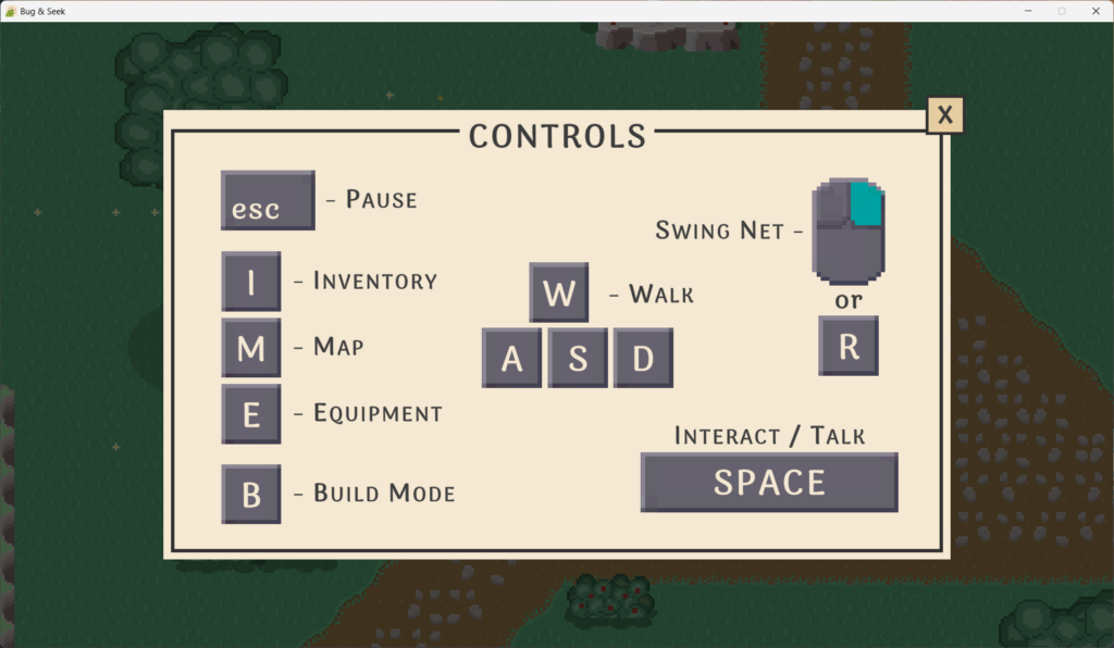
When I first started playing through the Bug & Seek demo to experience the game and identify areas whose UX could be improved, I saw that one of the first UIs that the player can see is the controls dialog explaining how the player can move and interact with the game world. The controls dialog served as a read-only, informative description of what buttons do what actions, but this could be improved for more readability and customizability.
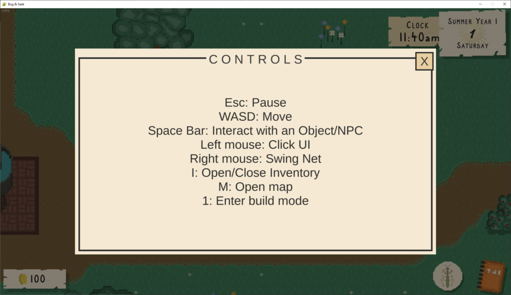
There are a few ways that games inform the player about the controls. For one, the order of buttons to actions is sometimes organized into a list of actions on the left and what buttons are associated with them on the right, such as in Stardew Valley and Don’t Starve, and left-aligning the list of actions (and possibly the list of controls as well) makes the controls screen even more readable. This is usually when there are a large number of controls used by the game.
Being able to edit the controls would ensure the player has some customizability, even if the defaults chosen are going to be preferred by the vast majority of players. However, some games such as Ori and the Blind Forest and Overcooked have fixed controls but visually explain them to players so it’s easier to understand their use. This also gives a lot of freedom for how to express the controls than in a simple list, and if simple enough, could forgo text explanations for gameplay visuals to more closely tie the controls to the actions they perform.
My recommendation from the available controls was to categorize them by context:
- Player interactions
- Move (WASD)
- Interact (Space)
- Swing net (Right-click)
- Menu interactions
- Pause (Esc)
- Enter build mode (1)
- Open/close inventory (I)
- Open/close map (M)
We wouldn’t need to include the “Click UI” control, though, because this is a given across all applications and games for UI interactions. The left mouse button would only need to be assigned to a control if there was a gameplay use for it (e.g., firing a gun in an FPS), but not for general UI interactions. For Bug & Seek, the number of interactions is small enough that I felt it could be fine to forgo rebinding controls, which would allow for this controls screen to be static but more visual. I felt like Ori’s explicit buttons-to-actions list on the left could work for Bug & Seek’s menu interactions, and Overcooked!’s visual representations could work for player interactions.
Here is the design that incorporated my thoughts for the controls dialog:
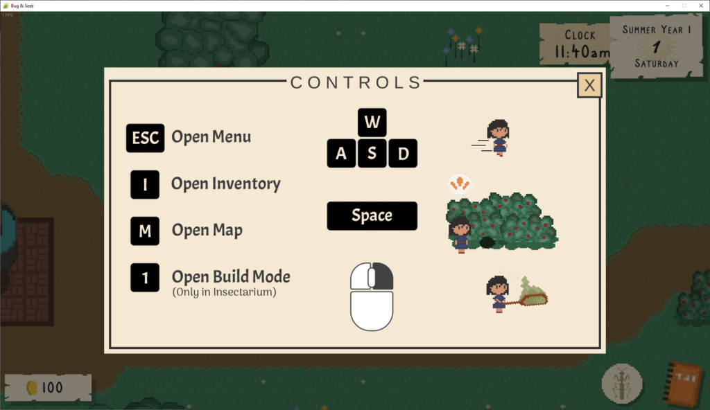
When building the design prototype for this screen, I combined elements of Ori and the Blind Forest’s and Overcooked!’s representations of their controls. While I would usually recommend having actions on the left and associated buttons on the right, it felt like the reverse worked better for this small number of actions so that it could be better aligned. Also, the image is static, but I would recommend animated graphics for movement, interaction, and swinging the net so it is even clearer what the buttons will do. My only concern would be that the interaction graphic is specifically on a bush so the player might not immediately know interaction via the space key works on a variety of objects and people, but the tutorial at the beginning of the game should help alleviate that.
With each design prototype created, I sent them to Chera for review and feedback. Here is what she said about the controls dialog designs:
Woo hoo! Ah, I love the little illustrations on the control screen!
Character Customization
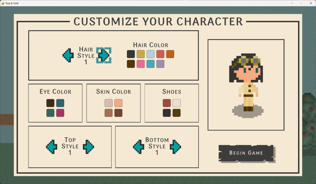
The character customization screen will be the first screen the player will see once they start a new game, so it should be as usable as possible to set the right tone for the rest of the game.
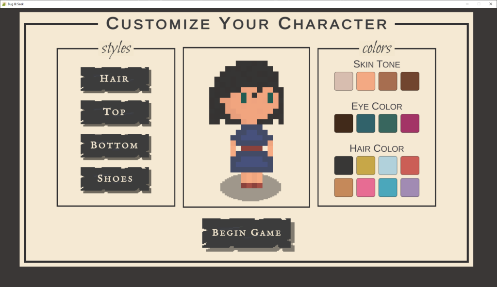
The biggest challenge on this screen is navigating the customization options, since players can only move forward through the list of options each click; if they happen to be clicking quickly and pass the one they were looking for, they have to navigate through the full list again to find it. Also, many times players will be comparing customization options, so they will want to quickly go to their preferred options to see them again before making their final choices. Since Bug & Seek’s customization is done through navigating a list, it can be more difficult to recognize where their option is in the list since the only thing they can reference is the visual change.
Some games like Stardew Valley support navigating backward and forward through numbered options when customizing a character, where players usually go through the full list of options, note the numbered options they prefer, and then bounce between the numbered options to compare them before finalizing their choice. In this approach, the character’s customization changes each time the player changes the option in the list.
In other games like Animal Crossing: New Horizon or the Mii editors on Wii and Wii U, they give visual representations of multiple options at once; players still navigate through a list of options, but that list is of pages rather than individual options. In this approach, the character’s customization changes only when the player selects an option on the page, so players can see the various customization options without making any changes yet to their character.
When redesigning the character customization experience, I reorganized the choices that are available on the character customization screen for clarity, to provide a simpler time exploring what options are available, and to make adding more options in the future more scalable. In particular, I recommended:
- Moving the character preview to the right side so all changes on the left impact the preview on the right rather than some changes on the left and right affect a preview in the middle.
- Adding new categories on the left for:
- Body: shows the skin tone options
- Eyes: Shows the eye color options
- Clicking on “Hair,” “Top,” or “Bottom” visually shows previews of the items
- Move the hair color options into the “Hair” category in addition to the hairstyles
- Clicking on “Shoes” shows color swatches rather than visual previews due to the simplicity of the visual representation of shoes
- Change the buttons with labels into smaller buttons with icons, similar to the style in the journal, which can give more screen real estate
Putting this all together, I created the designs below (navigate through the different options using the arrows at the bottom or by clicking/tapping on the image):
The design above shows how these changes can expand the capabilities of the character creation screen. It uses the Journal’s left navigation pattern for easy access to each of the sections. It also provides a scalable way to add new options to each section by reusing the pattern for selectable items from the Inventory screen, thus it can support a scrollbar when the available options expand past the visible limit if more customization options are added in the future. It also visually shows the hair, top, and bottom options so that players can select what they want at a glance rather than needing to click through a list. While the screens in the design may feel sparse, that can be addressed by making use of the additional real estate on the screen to add more options.
Codex Improvements
Overall, this section of the player’s journal handled organizing a lot of information about the bugs well. However, in the “Habitat” section for a selected bug, there was some inconsistency with how habitat information is displayed. Taking the Bumble Bee as an example, in Spring, Summer, and Fall, the day and night habitats were written as delineated lists of locations. However, for Winter, it was written in prose. Also, the Codex ultimately is a large list of all bugs in the game, so traversing through the huge list of bugs is a challenge because the player has to visually identify the bug they are looking for in the long list.
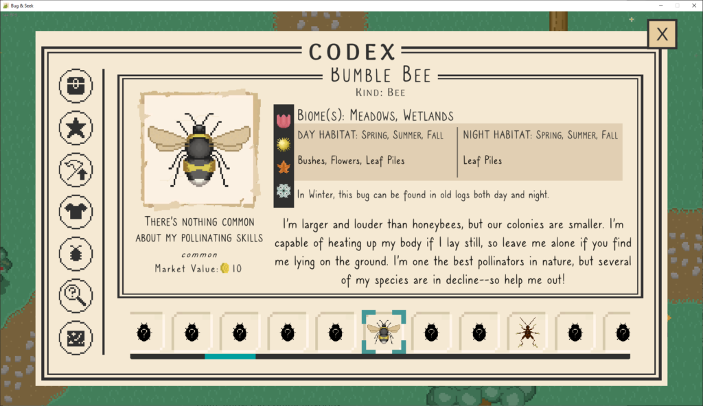
What could help with habitat consistency is if all seasons had “Day” and “Night” sections so that structure is always in place. Also, because of the long list of bugs, traversing through the huge list of bugs could benefit from searching, sorting, and filtering support. One way to do this would be to reconfigure this screen to have the bugs as a vertical list on the left rather than a horizontal list at the bottom so we have extra screen real estate for adding support for searching bugs by name, sorting alphabetically or reverse, and to provide filtering options to show, for example, all bugs that live in a certain habitat. In addition, it could support having the bug image and name together for better recognition while perusing the list and showing the names sorted alphabetically or reverse.
Putting all this together, I came up with the following design (use the arrows at the bottom to navigate or click/tap to navigate to the new codex design, then click on the habitat tabs to switch them):
While I didn’t end up incorporating sorting and filtering, I went with the vertical and searchable list of bugs on the left, which would help immensely with navigating through the large list of bugs. It gives enough real estate for showing the bug name as well, and the search term can match against both the bug names and kinds. For example, searching for “bee” should filter the list down to all bugs that have “bee” in the name (including any with “beetle” in the name), but also show bugs whose kind is “bee” (including any bees that happen to not have “bee” in their name, if they exist in the game).
Additionally, the right-hand panel of the codex has been reorganized. The bug’s profile image is in the same top-left position, but I moved the bug’s quote to the top right with large quotation mark graphics to give it its own defined space. Bug metadata like its kind, biome, rarity, and market value are grouped under the bug’s profile image, and the description is placed at the bottom of the panel.
The habitat information has also been positioned on the right with tabbed functionality so that we can minimize the amount of information shown at once to the player by only showing a season at a time. Clicking on other seasons will show the bug’s habitats during those periods, and an optimization can be to show the current season when the player comes to the codex so they don’t always have to move it away from spring every time during summer, fall, and winter. If a bug isn’t around during a particular season, that tab can be grayed out to show it is unselectable.
Sharing this with Chera, first with everything but the habitat contents, she said:
I love this! It looks like a better use of space than the current layout. 👏
And after adding the habitat contents:
Oh, this is brilliant!! 👏
From Concept to Reality
When I take on these UX design consultation opportunities, my ultimate goal is to use real-world situations to practice discovering UX issues, ideating solutions, and designing prototypes for those solutions. However, it was an encouraging outcome for consulting for Bug & Seek to see my design recommendations appearing in the game! Below I’ll show how these top 3 designs ended up being implemented.
Note: I began this consultation about two months before the game’s release, so due to the push that comes at the end of the game’s development, including last-minute features and addressing beta bugs, I was pleasantly surprised anything I suggested made it into the game. This also meant that due to these time constraints and the developers intimately knowing the heart of their own game, the in-game implementations incorporated much of the spirit of my recommendations rather than matching them exactly, aligning these recommendations with their vision for the game and ultimately creating a better experience.
First off, the controls dialog was updated to use the recommendations to align menu interactions on the left and player interactions on the right. While images were not used for the player interactions, the dialog included a playful arrangement of the player controls.
Next up is the character customization screen, whose implementation was an interesting story regarding timelines. The process I used when putting together my recommendations for Bug & Seek was to record a video of myself playing the game while mentioning issues and spitballing solutions, then later creating a document that breaks all of what I discussed into high-, medium-, and low-impact issues and what my recommendations would be. Finally, once that document was filled out, I used what I wrote to ideate a final design recommendation for a few of them in the form of a Figma prototype. There is sometimes a bit of a gap between when I write down my notes and when I finish my Figma prototype, and that’s where our story picks up.
I found out about the release date for the game about one month beforehand, so before I had started prototyping I sent over my finished notes to Chera and Craig so they could start reviewing and taking on any of the recommendations they had the bandwidth for. What I didn’t expect was how quickly they not only reviewed the notes but started implementing changes! This meant that by the time I was ready with my Figma prototype for the character creation screen, they had already implemented many of my general recommendations for the character creation screen, such as the numbered styles, forward and backward style buttons, consolidating hairstyles and colors together, and moving the character preview to the right. This already made character creation so much nicer, and if anything, the recommendations I proposed in my Figma designs can help this screen if they want to introduce more style and color options in future updates.
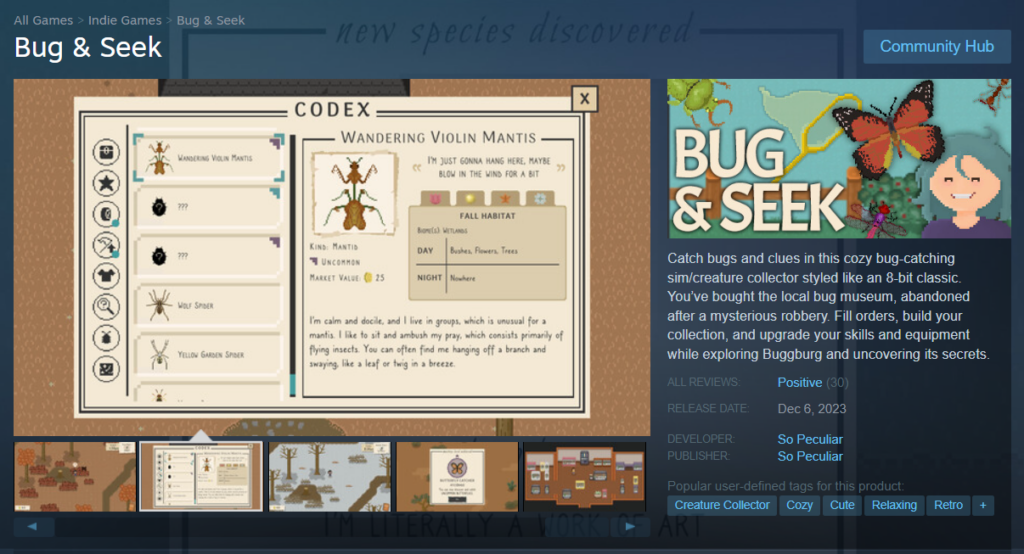
Finally, I was very happy to see the implementation of the codex screen in the game because it was almost a full match to my designs. Being able to see the bugs and their alphabetized names in the vertical list made it so much easier to navigate through the bugs. Not having the search bar was understandable seeing as that would be a non-trivial amount of functionality to implement in the intense days leading up to release. Perhaps in a future update!
What also was a nice surprise was seeing this codex appearing as a featured image on the Bug & Seek Steam page!
What I Learned
Consulting for Bug & Seek has been a significant learning experience for me because of how much time I invested in the breadth and depth of its UX designs. Here are the top three things I learned along this journey:
1. High-, medium-, and low-impact categorization worked well
As I mentioned above, I organized my consultation document with a variety of design guidance and prototypes separated into high-, medium-, and low-impact categories to help denote which ones would be vital to address and which ones would be nice-to-haves. Not only did this help the Bug & Seek team prioritize what to implement, but it also helped me prioritize which designs and prototypes to focus on next to best support them.
2. I provided too many suggestions
While I was able to provide a large amount of guidance for the Bug & Seek team (42 pages of text and images), it may not have been as helpful as a smaller, more focused list. With the team on the final stretch to release, many of my suggestions could not be addressed before the release date even if they wanted to. Next time I do a UX consultation, after taking notes from playing the game I will compile a subset of suggestions to prototype and present to the team. If they want to take on more beyond that, I can always share more guidance from the remaining items in my notes.
3. I should release design suggestions more cohesively
There were three parts to my deliverables: my playthrough video with verbal design suggestions, a document of design guidance, and Figma prototypes. I sent over the document to the team once I completed it along with the video, then iteratively sent over the prototypes as I completed them. This was good in that the team could read through the design guidance well before I could provide them with high-fidelity prototypes, but I also didn’t anticipate that some of the guidance would be implemented before my prototypes were delivered. The Bug & Seek team was fast!
While there’s nothing wrong with this, it meant that in some cases what I had envisioned for some of the guidance differed from what was implemented; it was just another interpretation of the guidance. One example is the character creation screen, where the prototype and implementation address the guidance in different ways. What I learned from this is that I should present the design guidance and prototypes together so that I can present my thoughts more cohesively and avoid being behind the development team’s momentum.
If you are interested in playing Bug & Seek yourself, you can check out their Steam page or wait for its release on Nintendo Switch next year. So Peculiar also has a point-and-click adventure game in the works called Closer Than You Know that I recommend you check out and wishlist on Steam!
OH, VERY AWESOME, Matt!
Michael Perrigo suggested that I might contact you for help with my current project, too! I’m impressed! I know you know your stuff but this was AMAZING!
Thank you, Michael! Sure, I’d be glad to discuss your project when you have some time. Let me know! 🙂